Print-Ready File Guidelines
Print-Ready File Guidelines
A practical prepress checklist for custom-print projects — notebooks, hardcover books, packaging boxes and more. This guide covers bleed, text outlining, CMYK setup, foil stamping, embossing, screen tints, image resolution and recommended file formats, so designers can avoid rework, rejected files and delivery delays. Please review each section before sending files; we are happy to answer any questions in advance.
1. Bleed & Safety Margin
Add 3mm bleed to all four sides, and keep important text and logos at least 5mm inside the trim line. Bleed prevents white edges showing after trimming. Apply 3mm bleed on the front cover, spine and back cover.
- Background colors and full-bleed images must extend past the trim line — never stop exactly on it
- Keep important text and logos at least 5mm inside the trim line, or they may be clipped
- Do not assume spine width — we will confirm it after page count and paper stock are finalized
- For foil and emboss mask layers, only add bleed when the artwork extends past the trim line; supply alongside the print file
2. Convert Text to Outlines
All text must be converted to vector outlines before sending to print, to prevent font substitution or layout shifts from missing fonts. If the print shop doesn't have the font installed, the software will substitute a different one — often breaking your layout.
- Illustrator: Select All → Type → Create Outlines
- InDesign: Select All → Type → Create Outlines, or enable font embedding during PDF export
- CorelDRAW: Select text → Convert to Curves
3. Use CMYK, Not RGB
Print files must be set to CMYK mode; RGB files sent directly to print will shift in color, and the shift cannot be corrected after printing. Screens display in RGB (light), print uses CMYK (ink) — they are fundamentally different systems, so colors will look different.
| Use case | Recommended mix | Why |
|---|---|---|
| Small text (12pt or smaller) | K:100 (CMY = 0) | Sharp registration, clean edges |
| Large solid black backgrounds | Rich black C40 M30 Y30 K100 | Deeper, more saturated tone |
| Body text | K:100 | Avoids misregistration on body copy |
| Pantone spot color | Mark Pantone number | Specify process simulation or dedicated plate |
- Mark any specified Pantone color in the file and indicate whether you want four-color process simulation or a dedicated spot-color plate — the two differ in cost and color accuracy
- Light screen tints: keep at least 10–15% ink coverage — anything lighter may not print visibly
4. Foil Stamping (Gold & Silver)
Foil-stamping masks must be supplied separately, using solid black (K:100) vector paths to mark the stamped area — never mixed into the print file layer. Foil stamping uses heated dies to press foil onto the surface; the mask preparation is different from regular printing and requires its own dedicated layer or AI file.
- Mark foil areas in solid K:100, on a dedicated layer or in a separate AI file
- Only add bleed on the mask if the artwork extends past the trim line; supply alongside the print file
- Do not use raster images or gradients to mark foil areas — vector-filled solid black only
- If the design uses multiple foil colors (gold + silver), supply each color as a separate layer and label clearly
- Minimum text size 8pt, minimum line weight 0.2mm
5. Embossing & Debossing
Embossing and debossing both require a separate K:100 vector mask, with line width and spacing of at least 0.4mm and text 12pt or larger. Embossing (raised image) uses a male-and-female die pair that presses against each other; debossing (recessed image) is typically produced by a foil-stamping plate with additional pressure. Neither process uses ink.
| Process | How it's made | Result |
|---|---|---|
| Embossing | Male die (top) and female die (bottom) pressed together, squeezing the paper between them | Raised image on the paper surface |
| Debossing | Foil-stamping plate with additional pressure (no foil applied) | Recessed image (subtle, low-key finish) |
| Foil-embossing | Combines foil stamping + embossing — requires two separate masks | Raised image in foil |
- Mark embossed/debossed areas in solid K:100 vector paths, on a dedicated layer
- Only add bleed on the mask if the artwork extends past the trim line; supply alongside the print file
- Line width and spacing of at least 0.4mm, text size 12pt or larger
- Embossing shows more clearly on thicker stock; on thin paper the effect is limited
- Keep embossed areas away from the trim edge to reduce the risk of cracking or distortion during pressing
6. Screen Tints & Gradients
Keep light screen tints at 10–15% minimum; lighter tones may not print visibly. For gradients, don't fade to 0% — leave 5–10% to avoid banding.
| Tint % | Print result |
|---|---|
| 5% | ✗ Barely visible, may not print |
| 10–14% | ⚠ Risky — depends on paper and press |
| 15–30% | ✓ Recommended minimum |
| 60%+ | ✓ Crisp and stable |
- Keep light screen tints at 10–15% minimum — lighter tones often don't print visibly
- For gradients, keep the lightest end at 5–10% rather than fading to 0% to avoid visible banding
- Thicken reversed type on dark backgrounds — fine strokes can blur from registration shift
- Finishing registration (foil, emboss) typically has 1–2mm tolerance — allow for this in your layout
7. Image Resolution
Print images need 300 dpi or higher at the actual output size; web images at 72 dpi will blur when enlarged for print.
| Source | Typical resolution | Print-ready? |
|---|---|---|
| Web / social download | 72 dpi | ✗ Blurs and pixelates when enlarged |
| Phone photo (original) | Varies by size | △ Must be verified at actual output size |
| Print raster image | 300 dpi+ | ✓ Sharp and clean |
| Logo / illustration (vector) | — | ✓ Resolution-independent |
- Print images need 300 dpi or higher, measured at the actual output size (not the file's original size)
- Images downloaded from the web are typically 72 dpi and will look soft when printed — not recommended
- Use vector formats (AI, EPS) for logos and illustrations — resolution-independent
8. File Formats
| Usage | Recommended format |
|---|---|
| Covers, logos, foil / emboss masks | AI (with dedicated finishing layers) |
| Interior pages | PDF (outlined text or embedded fonts) |
| Photo-based designs | PDF, TIFF (300 dpi+) |
| Not recommended | JPG, PNG (RGB), Word, PowerPoint |
Most Common Reasons Files Get Rejected
The following are the most common prepress issues we see. Checking these will significantly reduce rework and rejected files:
If you're unsure, send a draft for us to review before committing to a proof — it avoids late-stage changes that affect the delivery schedule.
File Submission Checklist
- ☐ 3mm bleed on all four sides, backgrounds extend past bleed line
- ☐ Key content at least 5mm inside trim line
- ☐ All text converted to outlines
- ☐ Effects expanded (Expand Appearance)
- ☐ Document color mode set to CMYK
- ☐ Images at 300 dpi or higher
- ☐ Foil and emboss masks on dedicated layers, in K:100 (with bleed only if mask extends past trim)
- ☐ Multiple finishing processes separated into distinct layers, clearly labeled
- ☐ Foil stamping on laminated surfaces confirmed in advance
- ☐ Editable original version backed up
Related Reading
Learn more about PUNDY's custom printing services:
| Topic | Link |
|---|---|
| Custom hardcover notebooks | View hardcover notebook series |
| Ordering process & lead time | See the full ordering process |
| FSC® certified materials | About FSC® certified notebooks |
| Eco-friendly soy ink | About eco-friendly soy ink |
| Frequently asked questions | Full FAQ |
Not sure if your file is print-ready?
Send your files with your inquiry so we can assess production and finishing feasibility, and reply within 1–2 business days.
Press Release
 4.6★ on Google · 38 Years of Trust
Real emails from international clients. Real Google reviews from long-term partners. See what 38 years of getting the details right looks like — in their own words.
Read More Awards of Taiwan Golden Print
PUNDY won awards of Taiwan Golden Print in 2011.
Read More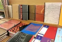 New Notebook for 2015
The business notebook designed by PUNDY is especially made for office users who love simple and fashionable designs.
Read More